UX
Nielsen’s 10 Usability Heuristics (Explained for Modern SaaS, with Real Examples)
Explore Jakob Nielsen's 10 fundamental principles for interaction design, often referred to as "heuristics." These guidelines serve as broad rules of thumb rather than rigid usability directives. Learn how to assess your website's usability using these insightful heuristics, accompanied by real-life examples.
Explore Jakob Nielsen's 10 fundamental principles for interaction design, often referred to as "heuristics." These guidelines serve as broad rules of thumb rather than rigid usability directives. Learn how to assess your website's usability using these insightful heuristics, accompanied by real-life examples.
Jorge González / Sasha Briceño
Jorge González / Sasha Briceño

What is usability?
It is all about how easily people can use a tool to accomplish a specific task. Regarding websites, web usability is about making sure your site is easy for visitors to navigate and use. When a website is user-friendly, visitors have a smoother experience and can achieve their goals more efficiently.
Who is Jakob Nielsen?
Jakob Nielsen is respected worldwide for his insights into user behavior online. He has laid out 10 usability heuristics. These aren't strict rules, but rather guiding principles for crafting interfaces that feel natural and easy for users to engage with.
Think of them as signposts pointing you in the direction of a user experience that's not just functional, but enjoyable. Let's explore each of these principles with some real-life examples:
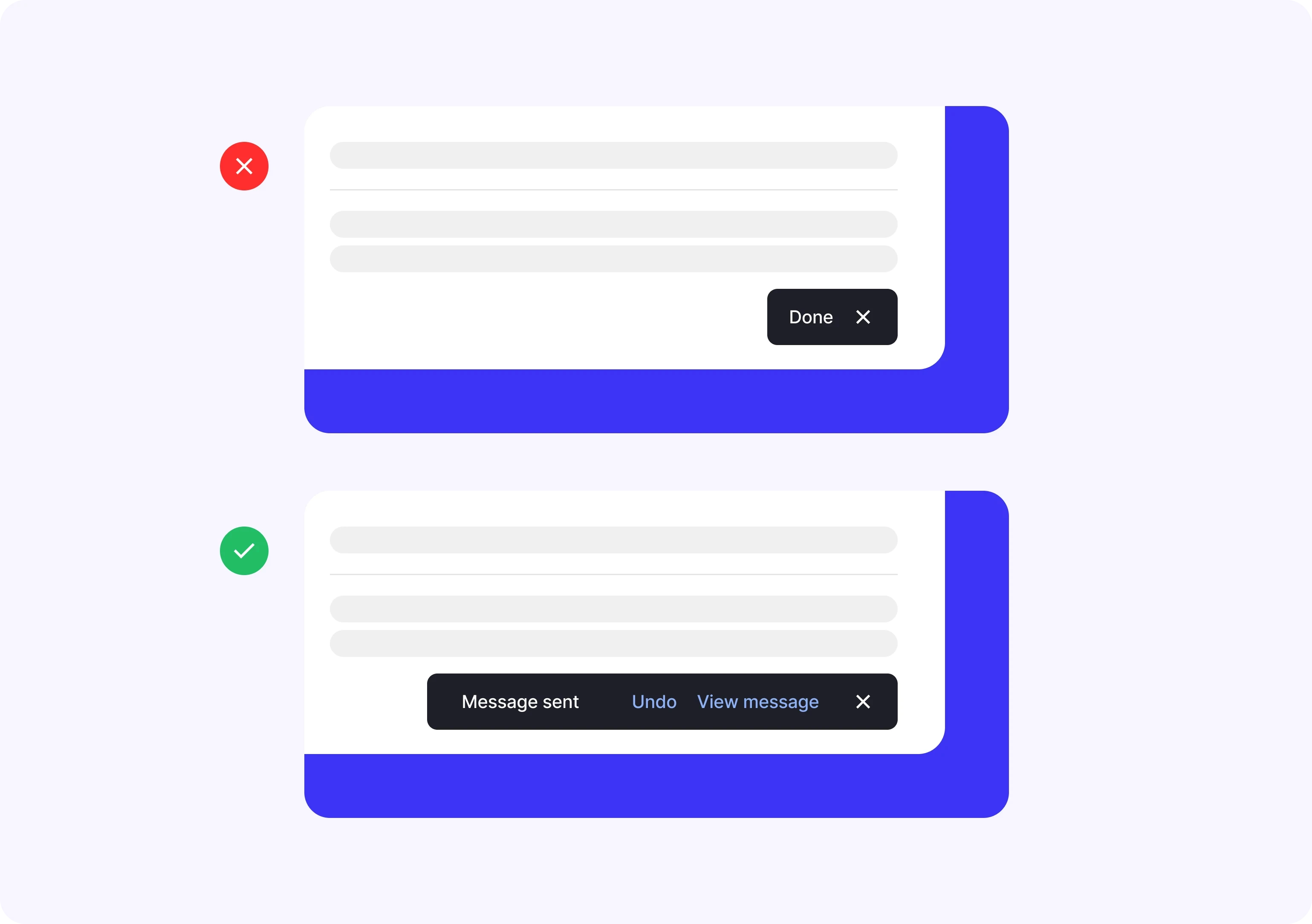
Visibility of system status:
Refers to the ability of a system or interface to communicate its current status and any changes occurring to the user immediately and understandably. This means that users should be aware of what is happening in the system at all times without the need for additional actions to obtain this information.
Examples:
Loading indicators: When loading a webpage, it's important to provide users with a visual indicator that the page is loading, such as loading animations, progress bars, or loading messages.
Form status: When users complete a form on a website, it's crucial to provide immediate feedback on the validity of their input, such as real-time validation messages indicating incorrect or missing information.
Update notifications: If changes are made to a website, such as content updates or modifications to the structure, it's important to inform users about these changes through pop-up notifications, messages at the top of the page, or notification icons.
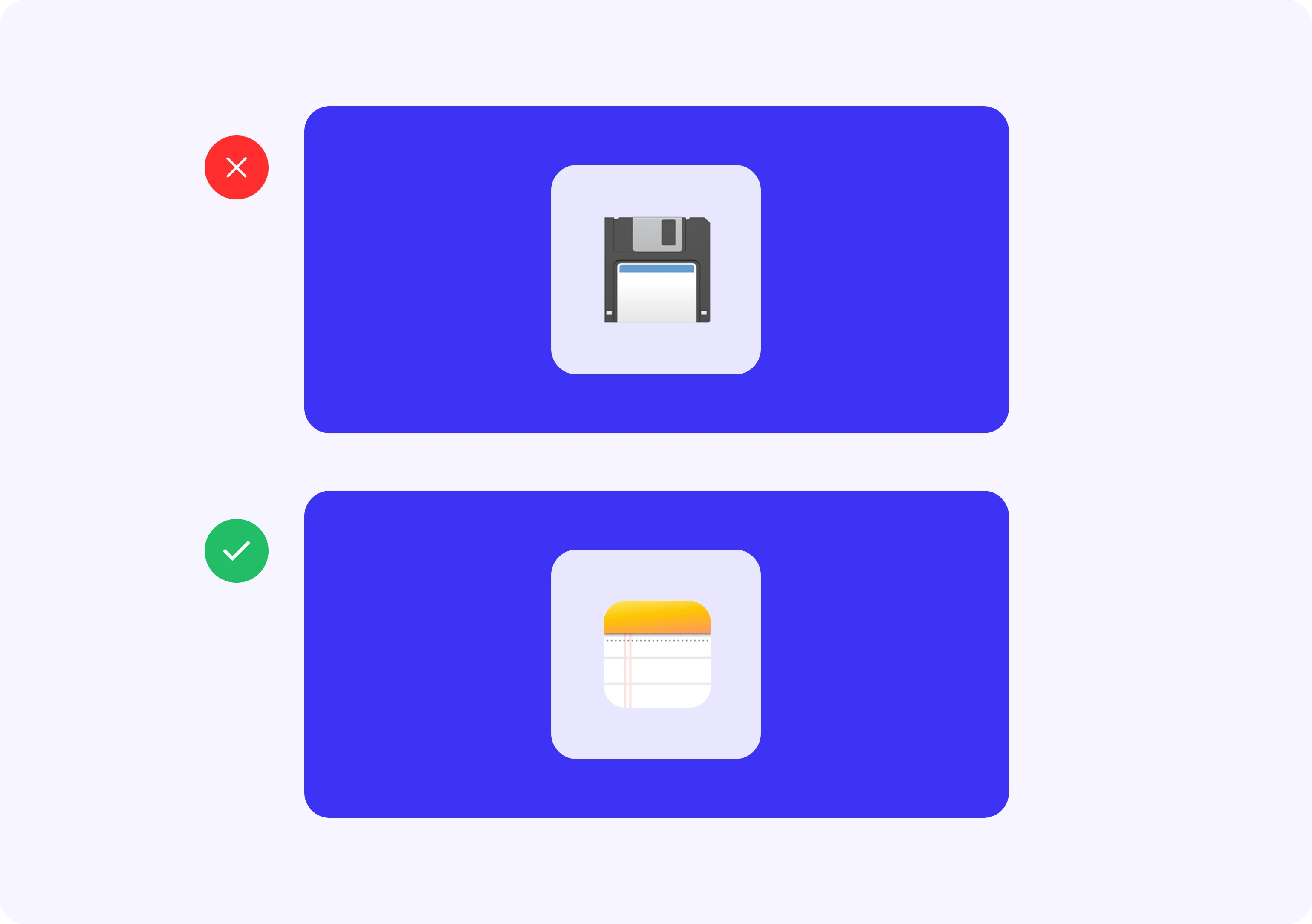
Match between the system and the real world:
The need for systems and interfaces to reflect and use terms, concepts, and conventions familiar to users, corresponding to their real-world experience and knowledge. This ensures that system elements are recognizable and understandable to users, avoiding the need to learn new conventions or terminology.
Examples:
Location-based navigation: Using terms and categories that reflect the structure and organization of content consistently with the user's experience. For example, an e-commerce website might organize products into categories like "Clothing," "Electronics," and "Home," aligning with users' real-world understanding.
Familiar iconography: Using recognizable icons and symbols meaningful to users. For instance, using a shopping cart icon to represent adding products to the cart on an online shopping site is a familiar metaphor aligned with users' real-world experience.
Clear and direct language: Using simple, understandable language reflecting users' expectations and needs. For example, in a website registration form, use terms like "Full Name" and "Email Address" instead of technical jargon or abstract terms.
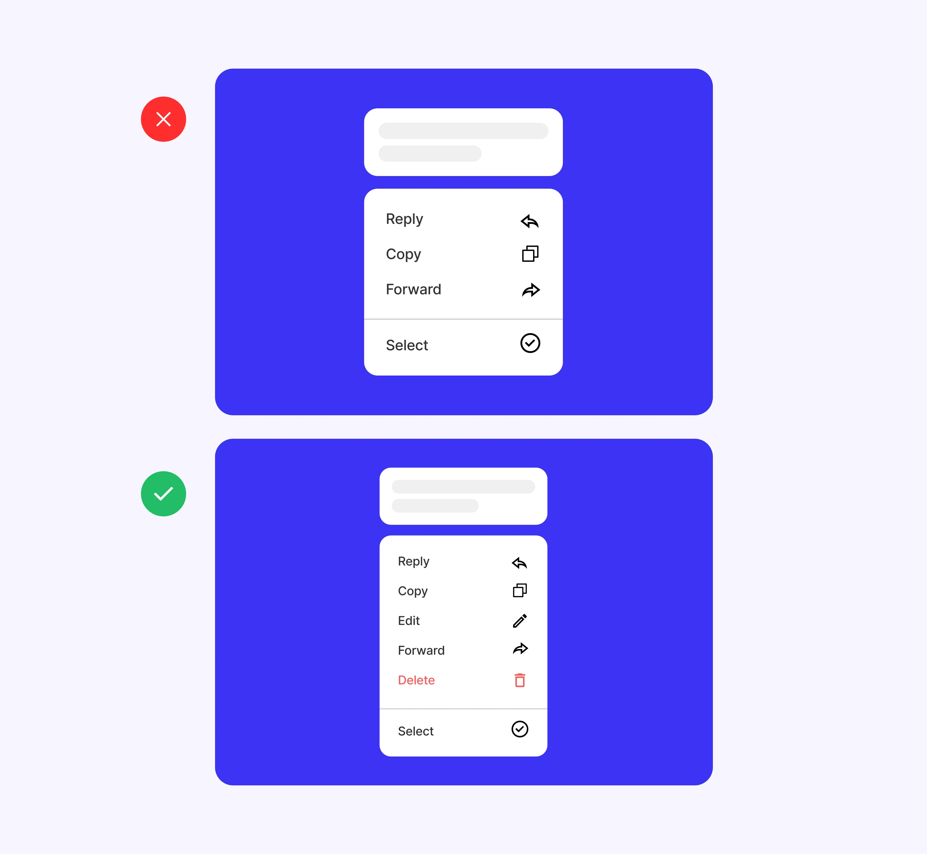
User control and freedom:
The ability users should have to control and navigate the system freely and without constraints. This involves providing clear options for users to undo unwanted actions, navigate back, or exit the system at any time without difficulty.
Examples:
"Back" button: Including a "Back" button or providing clear navigation allowing users to backtrack their actions and return to previous pages of the website.
Confirmation of critical actions: When performing significant actions with potentially irreversible consequences, such as deleting an item or canceling a subscription, it's important to request confirmation from the user to ensure they truly wish to proceed.
Clear navigation menus: Providing a clear and user-friendly navigation menu allows users to move around the website intuitively and quickly find the information they are seeking.
"Exit" or "Log Out" button: Including a visible button or link allowing users to log out or exit the website at any time.
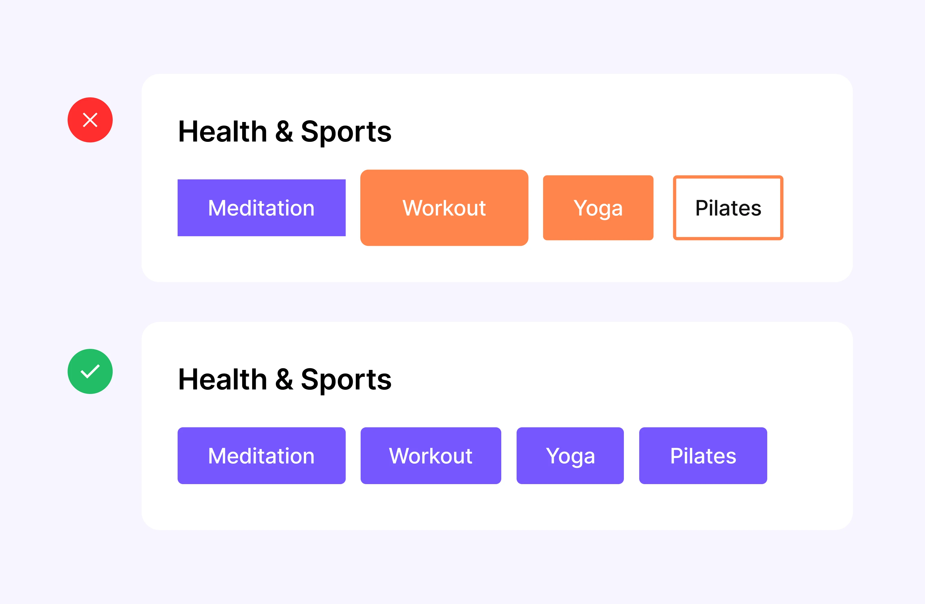
Consistency and standards:
The importance of maintaining consistency in design, interaction, and content presentation on a website, following recognized standards and established design conventions. This ensures that website elements behave predictably and are familiar to users, allowing them to navigate and use the site more efficiently and without confusion.
Examples:
Consistent visual design: Maintaining consistency in the visual appearance of the website by using consistent colors, typography, and design styles across all pages.
Uniform navigation: Using a consistent navigation structure throughout the website, with menus and links located in the same places and following the same order on all pages.
Standard design conventions: Following established design conventions recognized by users, such as using familiar icons to represent common actions (e.g., a shopping cart icon for adding products to the cart).
Consistency in terminology: Using consistent terms and labels to describe functions and actions across the website. For example, if the term "Sign In" is used on the login button on one page, the same term should be used on all pages instead of changing it to "Access" or "Connect."
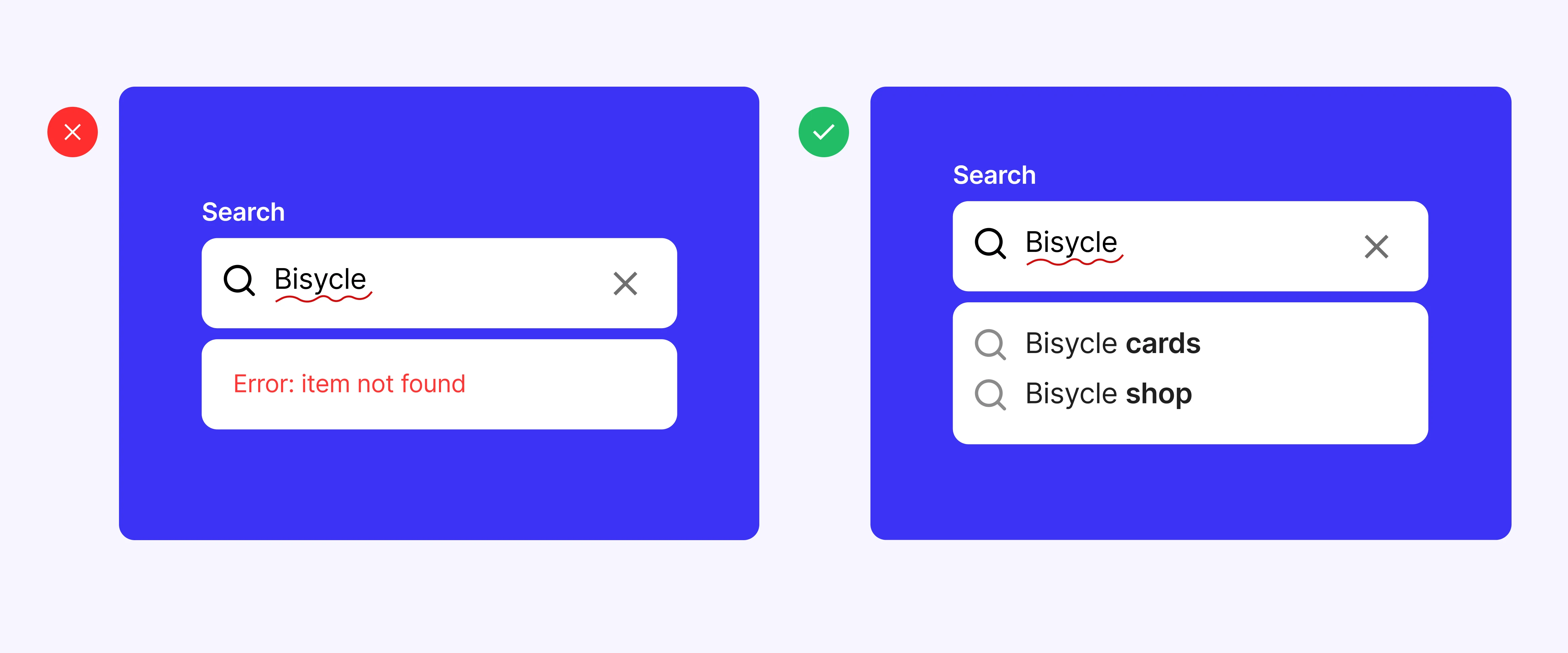
Error prevention:
Focuses on designing systems and user interfaces in a way that minimizes the possibility of users making errors during their interaction with the website or at least mitigates the consequences of such errors.
Examples:
Real-time form validation: Using real-time form validations to check data entered by users while completing a form. If a user attempts to submit a form without completing a required field, the system should display an instant error message indicating the missing field and required information.
Confirmations before critical actions: Requesting confirmations or alerts before users perform actions that may have significant or irreversible consequences. When attempting to delete a user account or make an expensive purchase, the system should request additional confirmation to ensure the user truly wants to proceed.
Clear and descriptive error messages: Provide clear and descriptive error messages indicating to the user what went wrong and how to correct the error. Avoiding generic or technical messages that may confuse the user. Instead of simply displaying "Error 404," explain "The page you're looking for cannot be found. Please check the URL and try again."
Intuitive and predictive design: Designing the user interface to be intuitive and predictive, avoiding confusing or ambiguous elements that may lead to user errors. Using recognizable icons and descriptive labels for site functions and actions, so users can easily understand how to interact with them.
Contextual help and tutorials: Providing contextual help and integrated tutorials that guide users through complex or unfamiliar processes. This may include pop-up help messages, links to support pages, or interactive tutorials explaining step-by-step how to perform certain actions on the site.
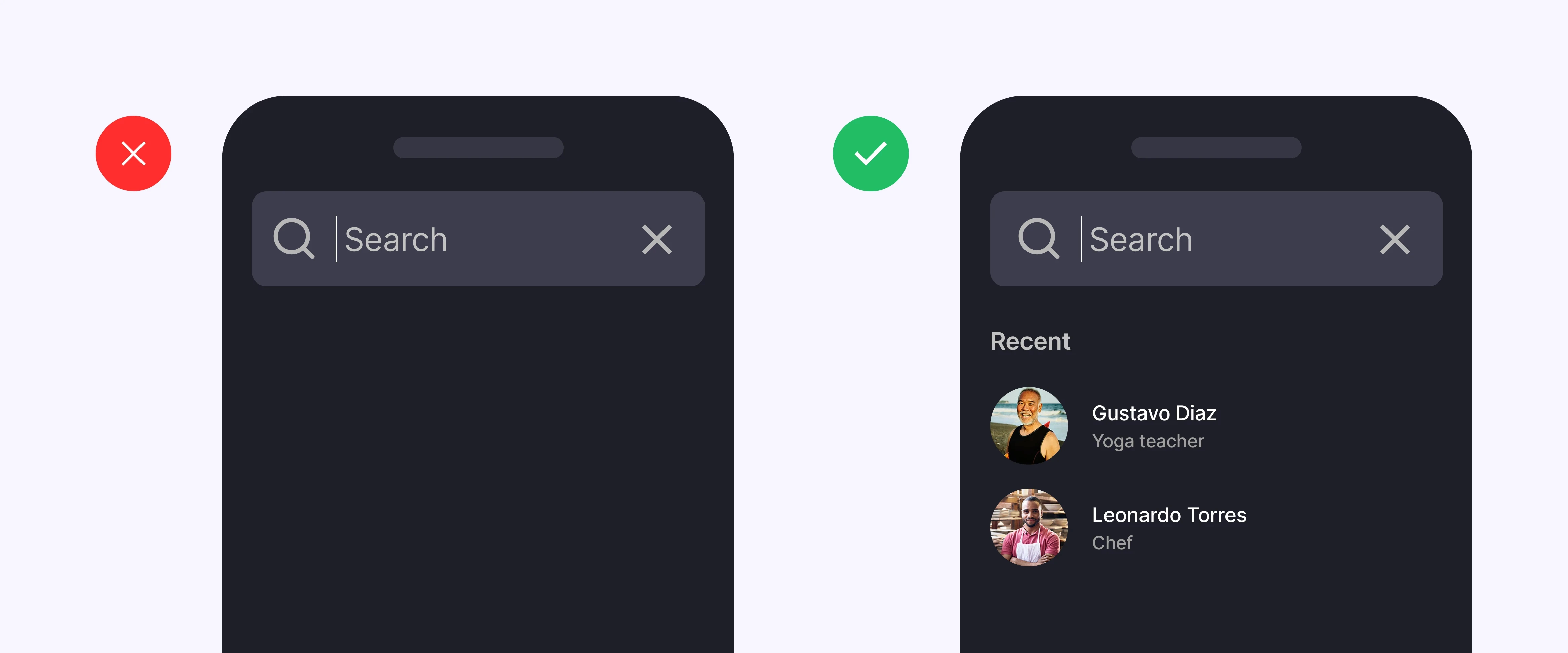
Recognition rather than recall:
Emphasizes designing user interfaces so that users can easily recognize available options and actions instead of having to remember specific information.
Examples:
Visible navigation menus: Instead of requiring users to remember specific page locations within the site, visible and accessible navigation menus should show clearly the different sections and categories of the site.
Descriptive buttons: Rather than using generic or ambiguous labels for buttons like "Click Here" or "More Information," it's preferable to use buttons with descriptive labels that indicate the action they will perform, such as "View Product Details" or "Download File."
Representational icons: Using recognizable icons or symbols that visually represent website actions or functions. An icon of a magnifying glass for the search function, a shopping cart icon for adding products to the cart, etc.
Contextual prompts: Provide contextual hints or visual cues when necessary, such as informative pop-up messages or tooltip indicators explaining the purpose or function of a specific element. When hovering over a button, a pop-up message could describe the action to be taken when clicking that button.

Flexibility and efficiency of use:
Focuses on a system or interface's ability to adapt to users' varied needs and abilities, allowing them to interact with the system efficiently regardless of their level of experience.
This involves providing options and tools that enable users to perform tasks quickly and efficiently, accommodating both novice and experienced users' interactions with the website according to their needs and preferences.
Examples:
Interface customization: Allowing users to customize the appearance or layout of the interface according to their individual preferences. Offering options to change text size, choose from different color themes, or rearrange homepage elements based on their needs.
Keyboard shortcuts: Providing keyboard shortcuts or hotkeys that allow users to navigate and perform actions more quickly and efficiently. Using key combinations for common actions like opening a new tab, closing a window, or submitting a form.
Advanced search options: Offering advanced search options that allow users to refine their queries and find specific information more efficiently. This could include search filters by date, category, location, etc., facilitating the search for relevant content within the website.
Preference settings: Allowing users to configure preferences such as language, time zone, email notifications, etc. This enables users to tailor the website experience to their individual needs and facilitates continued use of the site.
Smart suggestions: Providing contextual suggestions or recommendations based on user behavior to help them complete tasks more efficiently. Offering related products or suggested content based on previously visited pages or actions taken by the user on the site.
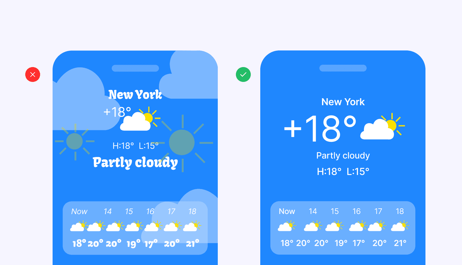
Aesthetic and minimalist design:
Emphasizes creating visually appealing and clean user interfaces, where unnecessary elements are removed, and simplicity in design is prioritized. This approach enhances user experience by reducing cognitive and visual load, allowing smoother and more efficient navigation.
Examples:
Simplicity in design: Minimalist design is characterized by simplicity and the absence of superfluous elements. A website with a clean design using plenty of white space, clear typography, and a few unnecessary visual elements conveys a sense of order and clarity.
Focus on relevant content: In an aesthetic and minimalist design, relevant content takes center stage. This means prioritizing important content elements and removing redundant or irrelevant content. For an e-commerce website, the design should focus on highlighting products and purchase information while minimizing the use of distracting elements.
Functionality over aesthetics: While aesthetic design is important, it should not compromise the functionality of the website. It's crucial to find a balance between aesthetics and usability. A minimalist design should ensure that navigation is clear and easy to understand for users, even if it means sacrificing certain decorative visual elements.
Visual consistency: Maintaining visual consistency throughout the website is critical for aesthetic and minimalist design. This includes using a consistent color palette, uniform typography styles, and consistent design elements across all pages. A website that maintains the same navigation structure and page design in all its sections provides a visually harmonious experience for users.
Focus on readability and accessibility: An aesthetic and minimalist design should prioritize content readability and accessibility for all users, including those with visual impairments. This involves using appropriate text size, sufficient color contrast, and providing accessibility options such as increasing text size or changing contrast.
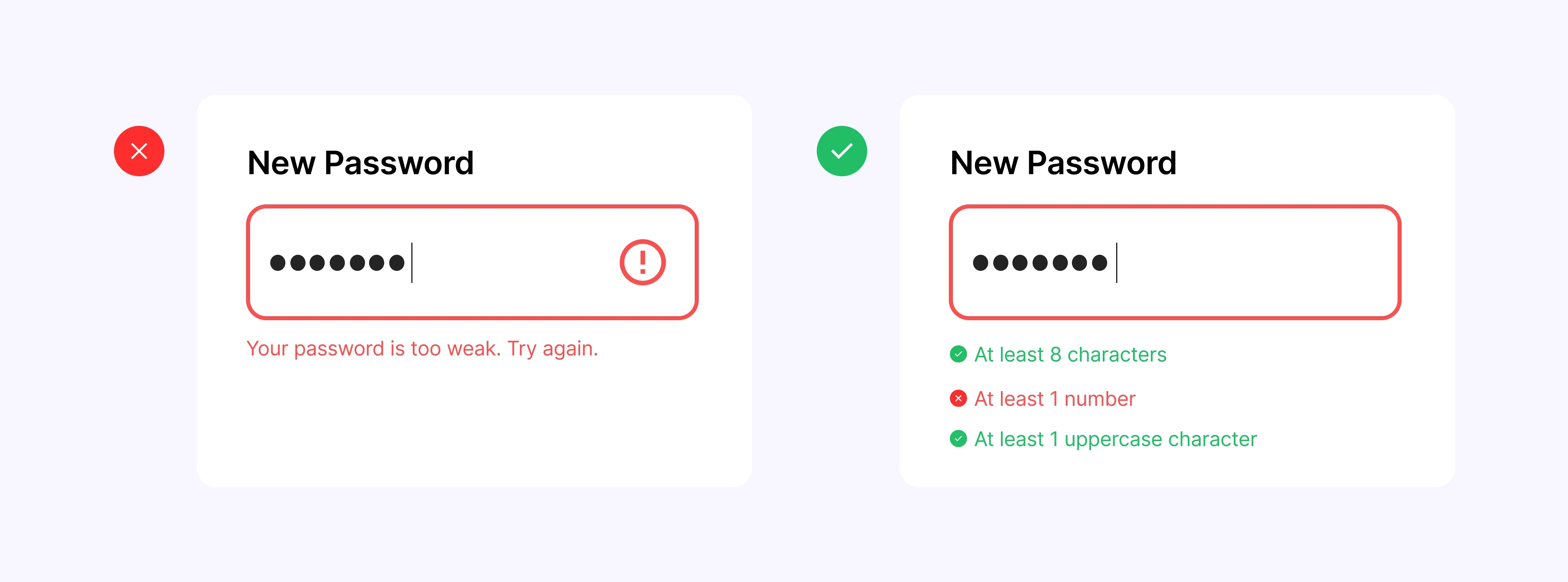
Help users recognize, diagnose, and recover from errors:
Focuses on designing user interfaces that help users recognize, understand, and correct errors when they occur during their interaction with the website.
Examples:
Clear error messages: When an error occurs, it's crucial to provide clear and descriptive error messages indicating to the user what went wrong and how to fix the issue. If a user tries to submit a form with incomplete information, the error message should specifically indicate which field is missing and what information is required.
Visual error indicators: In addition to error messages, visual indicators such as highlighting fields with errors in red or displaying a warning icon next to problematic elements can be used. These visual indicators help users quickly identify where errors are located and what actions they need to take to correct them.
Offer suggested solutions: Whenever possible, provide suggestions or suggested solutions to help users correct errors quickly and efficiently. If a user enters an incorrect email address when signing up for a website, the system could automatically suggest common corrections, such as checking the spelling or using a valid email format.
Help and support links: Include help and support links or buttons that direct users to additional resources where they can find more information on how to solve specific problems. Provide links to FAQs, step-by-step tutorials, or technical support pages where users can find additional help.
Undo and redo options: In situations where users perform actions that could lead to errors, such as deleting an important item or accidentally closing a window, provide undo and redo options to allow users to reverse their actions and recover easily from errors.
10. Help and documentation:
Focuses on the importance of providing users with easy and clear access to help and documentation information that allows them to understand and use the system effectively.
Examples:
Contextual help buttons or links: Integrating contextual help buttons or links in specific areas of the website where users may need additional guidance. Placing a question mark icon next to certain functions that, when clicked, display relevant information about their usage.
Assistance chatbots: Implementing assistance chatbots that are available to answer questions and provide help in real time. These chatbots can be especially useful for addressing quick inquiries or providing personalized guidance to users as they navigate the website.
Detailed technical documentation: For more advanced users or those seeking specific technical information, provide detailed documentation describing the structure and operation of the system. This documentation may include architecture diagrams, technical specifications, and other technical resources.
Instructional videos: Create instructional videos or video tutorials demonstrating how to use various features and functionalities of the website visually and practically. These videos can be especially helpful for visual users or those who prefer to learn through practical demonstrations.
User forums: Establish user forums where users can interact with each other, ask questions, share tips, and troubleshoot problems collaboratively. These forums can serve as an invaluable source of information and support for the website's user community.
Conclusion
For businesses aiming to establish a functional and scalable online presence for their products or services, investing in information architecture is not just advisable—it's essential. Your website serves as the digital face of your brand, akin to a physical storefront, and thus must be inviting, intuitive, and easy to navigate.
When usability is implemented effectively, it significantly enhances the usability and effectiveness of a webpage, fostering a seamless and satisfying user experience.
By strategically organizing and structuring content, navigation, and functionalities, you can guide users effortlessly toward their goals, whether it's making a purchase, signing up for a service, or gathering information. A well-designed website minimizes confusion and reduces friction points, ultimately increasing conversion rates and customer satisfaction.
FAQs:
Q1. Why are Nielsen’s heuristics still relevant in 2026?
Because technology evolves, but human behavior doesn’t. Jakob Nielsen’s heuristics are rooted in cognitive psychology — they’re about how people perceive clarity, trust, and control. That’s why they’ve aged so well.
Whether you’re designing AI-driven tools, immersive interfaces, or everyday apps, these principles still anchor good UX. They help teams simplify complexity, build consistency, and protect the emotional integrity of a digital experience.
Q2. How can I tell if my design actually follows these heuristics?
Don’t rely on a checklist — look at how real users behave. If people hesitate, backtrack, or ask for help, something’s off. Observe the visibility of system status, the consistency of language, and the cognitive effort required.
In short: if you have to explain how to use your product, a heuristic is being ignored. The best designs make sense before they’re explained.
Q3. What are the most common mistakes when applying them?
Treating heuristics as commandments instead of guidelines. Over-applying them often kills personality. Usability isn’t about stripping character — it’s about making clarity feel natural.
Another mistake is ignoring context: what works for a banking app might feel lifeless in a creative platform. The craft lies in balance — function should serve emotion, not erase it.
Q4. How can a design studio add value through these principles?
A great studio doesn’t just apply heuristics; it interprets them through your brand’s DNA. At Noodlesoup, we see usability as a form of trust expressed through design.
It’s not about bigger buttons or safer layouts, it’s about creating interfaces that feel intuitive, beautiful, and unmistakably yours. We turn usability into an experience that both works and moves people.
What is usability?
It is all about how easily people can use a tool to accomplish a specific task. Regarding websites, web usability is about making sure your site is easy for visitors to navigate and use. When a website is user-friendly, visitors have a smoother experience and can achieve their goals more efficiently.
Who is Jakob Nielsen?
Jakob Nielsen is respected worldwide for his insights into user behavior online. He has laid out 10 usability heuristics. These aren't strict rules, but rather guiding principles for crafting interfaces that feel natural and easy for users to engage with.
Think of them as signposts pointing you in the direction of a user experience that's not just functional, but enjoyable. Let's explore each of these principles with some real-life examples:

Visibility of system status:
Refers to the ability of a system or interface to communicate its current status and any changes occurring to the user immediately and understandably. This means that users should be aware of what is happening in the system at all times without the need for additional actions to obtain this information.
Examples:
Loading indicators: When loading a webpage, it's important to provide users with a visual indicator that the page is loading, such as loading animations, progress bars, or loading messages.
Form status: When users complete a form on a website, it's crucial to provide immediate feedback on the validity of their input, such as real-time validation messages indicating incorrect or missing information.
Update notifications: If changes are made to a website, such as content updates or modifications to the structure, it's important to inform users about these changes through pop-up notifications, messages at the top of the page, or notification icons.

Match between the system and the real world:
The need for systems and interfaces to reflect and use terms, concepts, and conventions familiar to users, corresponding to their real-world experience and knowledge. This ensures that system elements are recognizable and understandable to users, avoiding the need to learn new conventions or terminology.
Examples:
Location-based navigation: Using terms and categories that reflect the structure and organization of content consistently with the user's experience. For example, an e-commerce website might organize products into categories like "Clothing," "Electronics," and "Home," aligning with users' real-world understanding.
Familiar iconography: Using recognizable icons and symbols meaningful to users. For instance, using a shopping cart icon to represent adding products to the cart on an online shopping site is a familiar metaphor aligned with users' real-world experience.
Clear and direct language: Using simple, understandable language reflecting users' expectations and needs. For example, in a website registration form, use terms like "Full Name" and "Email Address" instead of technical jargon or abstract terms.

User control and freedom:
The ability users should have to control and navigate the system freely and without constraints. This involves providing clear options for users to undo unwanted actions, navigate back, or exit the system at any time without difficulty.
Examples:
"Back" button: Including a "Back" button or providing clear navigation allowing users to backtrack their actions and return to previous pages of the website.
Confirmation of critical actions: When performing significant actions with potentially irreversible consequences, such as deleting an item or canceling a subscription, it's important to request confirmation from the user to ensure they truly wish to proceed.
Clear navigation menus: Providing a clear and user-friendly navigation menu allows users to move around the website intuitively and quickly find the information they are seeking.
"Exit" or "Log Out" button: Including a visible button or link allowing users to log out or exit the website at any time.

Consistency and standards:
The importance of maintaining consistency in design, interaction, and content presentation on a website, following recognized standards and established design conventions. This ensures that website elements behave predictably and are familiar to users, allowing them to navigate and use the site more efficiently and without confusion.
Examples:
Consistent visual design: Maintaining consistency in the visual appearance of the website by using consistent colors, typography, and design styles across all pages.
Uniform navigation: Using a consistent navigation structure throughout the website, with menus and links located in the same places and following the same order on all pages.
Standard design conventions: Following established design conventions recognized by users, such as using familiar icons to represent common actions (e.g., a shopping cart icon for adding products to the cart).
Consistency in terminology: Using consistent terms and labels to describe functions and actions across the website. For example, if the term "Sign In" is used on the login button on one page, the same term should be used on all pages instead of changing it to "Access" or "Connect."

Error prevention:
Focuses on designing systems and user interfaces in a way that minimizes the possibility of users making errors during their interaction with the website or at least mitigates the consequences of such errors.
Examples:
Real-time form validation: Using real-time form validations to check data entered by users while completing a form. If a user attempts to submit a form without completing a required field, the system should display an instant error message indicating the missing field and required information.
Confirmations before critical actions: Requesting confirmations or alerts before users perform actions that may have significant or irreversible consequences. When attempting to delete a user account or make an expensive purchase, the system should request additional confirmation to ensure the user truly wants to proceed.
Clear and descriptive error messages: Provide clear and descriptive error messages indicating to the user what went wrong and how to correct the error. Avoiding generic or technical messages that may confuse the user. Instead of simply displaying "Error 404," explain "The page you're looking for cannot be found. Please check the URL and try again."
Intuitive and predictive design: Designing the user interface to be intuitive and predictive, avoiding confusing or ambiguous elements that may lead to user errors. Using recognizable icons and descriptive labels for site functions and actions, so users can easily understand how to interact with them.
Contextual help and tutorials: Providing contextual help and integrated tutorials that guide users through complex or unfamiliar processes. This may include pop-up help messages, links to support pages, or interactive tutorials explaining step-by-step how to perform certain actions on the site.

Recognition rather than recall:
Emphasizes designing user interfaces so that users can easily recognize available options and actions instead of having to remember specific information.
Examples:
Visible navigation menus: Instead of requiring users to remember specific page locations within the site, visible and accessible navigation menus should show clearly the different sections and categories of the site.
Descriptive buttons: Rather than using generic or ambiguous labels for buttons like "Click Here" or "More Information," it's preferable to use buttons with descriptive labels that indicate the action they will perform, such as "View Product Details" or "Download File."
Representational icons: Using recognizable icons or symbols that visually represent website actions or functions. An icon of a magnifying glass for the search function, a shopping cart icon for adding products to the cart, etc.
Contextual prompts: Provide contextual hints or visual cues when necessary, such as informative pop-up messages or tooltip indicators explaining the purpose or function of a specific element. When hovering over a button, a pop-up message could describe the action to be taken when clicking that button.

Flexibility and efficiency of use:
Focuses on a system or interface's ability to adapt to users' varied needs and abilities, allowing them to interact with the system efficiently regardless of their level of experience.
This involves providing options and tools that enable users to perform tasks quickly and efficiently, accommodating both novice and experienced users' interactions with the website according to their needs and preferences.
Examples:
Interface customization: Allowing users to customize the appearance or layout of the interface according to their individual preferences. Offering options to change text size, choose from different color themes, or rearrange homepage elements based on their needs.
Keyboard shortcuts: Providing keyboard shortcuts or hotkeys that allow users to navigate and perform actions more quickly and efficiently. Using key combinations for common actions like opening a new tab, closing a window, or submitting a form.
Advanced search options: Offering advanced search options that allow users to refine their queries and find specific information more efficiently. This could include search filters by date, category, location, etc., facilitating the search for relevant content within the website.
Preference settings: Allowing users to configure preferences such as language, time zone, email notifications, etc. This enables users to tailor the website experience to their individual needs and facilitates continued use of the site.
Smart suggestions: Providing contextual suggestions or recommendations based on user behavior to help them complete tasks more efficiently. Offering related products or suggested content based on previously visited pages or actions taken by the user on the site.

Aesthetic and minimalist design:
Emphasizes creating visually appealing and clean user interfaces, where unnecessary elements are removed, and simplicity in design is prioritized. This approach enhances user experience by reducing cognitive and visual load, allowing smoother and more efficient navigation.
Examples:
Simplicity in design: Minimalist design is characterized by simplicity and the absence of superfluous elements. A website with a clean design using plenty of white space, clear typography, and a few unnecessary visual elements conveys a sense of order and clarity.
Focus on relevant content: In an aesthetic and minimalist design, relevant content takes center stage. This means prioritizing important content elements and removing redundant or irrelevant content. For an e-commerce website, the design should focus on highlighting products and purchase information while minimizing the use of distracting elements.
Functionality over aesthetics: While aesthetic design is important, it should not compromise the functionality of the website. It's crucial to find a balance between aesthetics and usability. A minimalist design should ensure that navigation is clear and easy to understand for users, even if it means sacrificing certain decorative visual elements.
Visual consistency: Maintaining visual consistency throughout the website is critical for aesthetic and minimalist design. This includes using a consistent color palette, uniform typography styles, and consistent design elements across all pages. A website that maintains the same navigation structure and page design in all its sections provides a visually harmonious experience for users.
Focus on readability and accessibility: An aesthetic and minimalist design should prioritize content readability and accessibility for all users, including those with visual impairments. This involves using appropriate text size, sufficient color contrast, and providing accessibility options such as increasing text size or changing contrast.

Help users recognize, diagnose, and recover from errors:
Focuses on designing user interfaces that help users recognize, understand, and correct errors when they occur during their interaction with the website.
Examples:
Clear error messages: When an error occurs, it's crucial to provide clear and descriptive error messages indicating to the user what went wrong and how to fix the issue. If a user tries to submit a form with incomplete information, the error message should specifically indicate which field is missing and what information is required.
Visual error indicators: In addition to error messages, visual indicators such as highlighting fields with errors in red or displaying a warning icon next to problematic elements can be used. These visual indicators help users quickly identify where errors are located and what actions they need to take to correct them.
Offer suggested solutions: Whenever possible, provide suggestions or suggested solutions to help users correct errors quickly and efficiently. If a user enters an incorrect email address when signing up for a website, the system could automatically suggest common corrections, such as checking the spelling or using a valid email format.
Help and support links: Include help and support links or buttons that direct users to additional resources where they can find more information on how to solve specific problems. Provide links to FAQs, step-by-step tutorials, or technical support pages where users can find additional help.
Undo and redo options: In situations where users perform actions that could lead to errors, such as deleting an important item or accidentally closing a window, provide undo and redo options to allow users to reverse their actions and recover easily from errors.

10. Help and documentation:
Focuses on the importance of providing users with easy and clear access to help and documentation information that allows them to understand and use the system effectively.
Examples:
Contextual help buttons or links: Integrating contextual help buttons or links in specific areas of the website where users may need additional guidance. Placing a question mark icon next to certain functions that, when clicked, display relevant information about their usage.
Assistance chatbots: Implementing assistance chatbots that are available to answer questions and provide help in real time. These chatbots can be especially useful for addressing quick inquiries or providing personalized guidance to users as they navigate the website.
Detailed technical documentation: For more advanced users or those seeking specific technical information, provide detailed documentation describing the structure and operation of the system. This documentation may include architecture diagrams, technical specifications, and other technical resources.
Instructional videos: Create instructional videos or video tutorials demonstrating how to use various features and functionalities of the website visually and practically. These videos can be especially helpful for visual users or those who prefer to learn through practical demonstrations.
User forums: Establish user forums where users can interact with each other, ask questions, share tips, and troubleshoot problems collaboratively. These forums can serve as an invaluable source of information and support for the website's user community.
Conclusion
For businesses aiming to establish a functional and scalable online presence for their products or services, investing in information architecture is not just advisable—it's essential. Your website serves as the digital face of your brand, akin to a physical storefront, and thus must be inviting, intuitive, and easy to navigate.
When usability is implemented effectively, it significantly enhances the usability and effectiveness of a webpage, fostering a seamless and satisfying user experience.
By strategically organizing and structuring content, navigation, and functionalities, you can guide users effortlessly toward their goals, whether it's making a purchase, signing up for a service, or gathering information. A well-designed website minimizes confusion and reduces friction points, ultimately increasing conversion rates and customer satisfaction.
FAQs:
Q1. Why are Nielsen’s heuristics still relevant in 2026?
Because technology evolves, but human behavior doesn’t. Jakob Nielsen’s heuristics are rooted in cognitive psychology — they’re about how people perceive clarity, trust, and control. That’s why they’ve aged so well.
Whether you’re designing AI-driven tools, immersive interfaces, or everyday apps, these principles still anchor good UX. They help teams simplify complexity, build consistency, and protect the emotional integrity of a digital experience.
Q2. How can I tell if my design actually follows these heuristics?
Don’t rely on a checklist — look at how real users behave. If people hesitate, backtrack, or ask for help, something’s off. Observe the visibility of system status, the consistency of language, and the cognitive effort required.
In short: if you have to explain how to use your product, a heuristic is being ignored. The best designs make sense before they’re explained.
Q3. What are the most common mistakes when applying them?
Treating heuristics as commandments instead of guidelines. Over-applying them often kills personality. Usability isn’t about stripping character — it’s about making clarity feel natural.
Another mistake is ignoring context: what works for a banking app might feel lifeless in a creative platform. The craft lies in balance — function should serve emotion, not erase it.
Q4. How can a design studio add value through these principles?
A great studio doesn’t just apply heuristics; it interprets them through your brand’s DNA. At Noodlesoup, we see usability as a form of trust expressed through design.
It’s not about bigger buttons or safer layouts, it’s about creating interfaces that feel intuitive, beautiful, and unmistakably yours. We turn usability into an experience that both works and moves people.
Estrategias de branding y web para SaaS, directo a tu inbox
Un email semanal con lo que aprendemos trabajando con startups B2B. Sin relleno.
Acerca de nosotros
Acerca de nosotros
El estudio fue fundado en 2022 por Alejandro Duarte, diseñador multidisciplinario con más de 10 años de experiencia en la creación de productos digitales premiados y en colaborar con marcas de la Fortune 500. Junto a Sasha Briceño, directora creativa híbrida con formación en comunicación social que combina su pasión por las imágenes, el pensamiento estratégico y el storytelling, para crear universos de marca verbales y visuales consistentes. En Noodlesoup, somos un equipo apasionado por el buen diseño y comprometido con proyectos que tienen un propósito significativo. La colaboración, entre el equipo y con nuestros clientes, está en el corazón de todo lo que hacemos: es el umami* que nos caracteriza.
*Japonés: Conocido como el quinto sabor, es uno de los gustos básicos junto con el dulce, el ácido, el amargo y el salado. También significa sabroso.

