Branding
Branding
Beyond aesthetics: visual storytelling for brand impact
Brands that thrive today tell their stories through captivating visuals. Why? By leveraging visual storytelling, brands create immersive experiences that don't just grab attention, they spark emotions, build trust, drive loyalty, and ultimately boost sales. At Noodlesoup, we're not just content creators, developers, or designers, we're shapers of brand narrative, and here is how we do it.
Brands that thrive today tell their stories through captivating visuals. Why? By leveraging visual storytelling, brands create immersive experiences that don't just grab attention, they spark emotions, build trust, drive loyalty, and ultimately boost sales. At Noodlesoup, we're not just content creators, developers, or designers, we're shapers of brand narrative, and here is how we do it.
Brands that thrive today tell their stories through captivating visuals. Why? By leveraging visual storytelling, brands create immersive experiences that don't just grab attention, they spark emotions, build trust, drive loyalty, and ultimately boost sales. At Noodlesoup, we're not just content creators, developers, or designers, we're shapers of brand narrative, and here is how we do it.
Jorge González / Sasha Briceño
Jorge González / Sasha Briceño
23 feb 2024
23 feb 2024


What is visual storytelling? What is its purpose?
The visual storyteling is a technique that uses images, graphics, videos, and visual elements to share a story or convey a message. Unlike traditional storytelling, which relies on words to create a narrative, visual storytelling harnesses the power of images to communicate in a striking and effective manner.
This method goes beyond mere storytelling; it aims to craft an engaging involvement that seizes the audience's focus and establishes a heartfelt bond. It acts as a powerful instrument in shaping a brand by providing a more captivating and unforgettable means of expressing a company's principles, objectives, and character.
What is the importance of visual storytelling in brand creation?
The importance of visual storytelling in brand creation is monumental in today's landscape. Its power lies in several key aspects that directly impact audience connection.
Firstly, visual storytelling establishes a deep emotional connection. Images and visual elements convey messages swiftly and powerfully, creating an immersive experience that resonates in the consumer's memory. This emotional connection goes beyond the rational, allowing the brand to root itself in the audience's feelings.
Moreover, visual storytelling stands out as a differentiating tool in an information-saturated and competitive environment. A solid and engaging visual narrative has the power to shine amidst a sea of visual stimuli, capturing attention and making the brand memorable to its audience.
Another key factor is the ability of visual storytelling to facilitate understanding and information retention. Its visual nature simplifies the data absorption process for consumers, increasing the likelihood that the brand's story will be remembered and understood.
Lastly, the versatility of visual storytelling is another feather in its cap. It easily adapts to a wide array of platforms, from social media to websites and mobile applications, enabling a coherent and effective strategy across different communication channels.
In Noodlesoup, our main focus in creating good visual storytelling lies in delving into the customer's and project's needs. Some of the key questions we ponder for deeper insight are:
• How can we tackle the challenge posed by the brand?
• What would be the most effective ways to tell this story?
• What elements do I need for this storytelling?
This Q&A process is vital for grasping a client's brand vision. It involves analyzing voice tone, defining goals, understanding the target audience, assessing communication channels, and determining the extent of brand transformation—ranging from a complete overhaul to ecosystem expansion or introducing new services. This systematic approach ensures a comprehensive understanding of the client's brand aspirations.
Here is a list of some questions to do so:
What is this person currently expressing?
What are the goals they want to achieve for this person or product?
What is the audience that will consume the brand like?
What channels are they using?
Do they want a 180-degree change or just to expand the brand's resources?
Do they want a complete brand revamp?
Do they want to expand the ecosystem?
Do they want to introduce a new service, and will that new service be integrated into their current brand?
An excellent example would be when one of our clients, whose audience was mainly on WhatsApp, wanted to enhance the storytelling of their brand. In the creation process, we realized we needed to focus significantly on the resources they had to use in this network to communicate with their customers. So, a great idea struck us: What better way to enrich this brand's storytelling on WhatsApp than through stickers? These ranged from symbols to messages and allowed us to keep telling the client's story.
Elements and recommendations that enhance the effectiveness of visual storytelling within a brand:
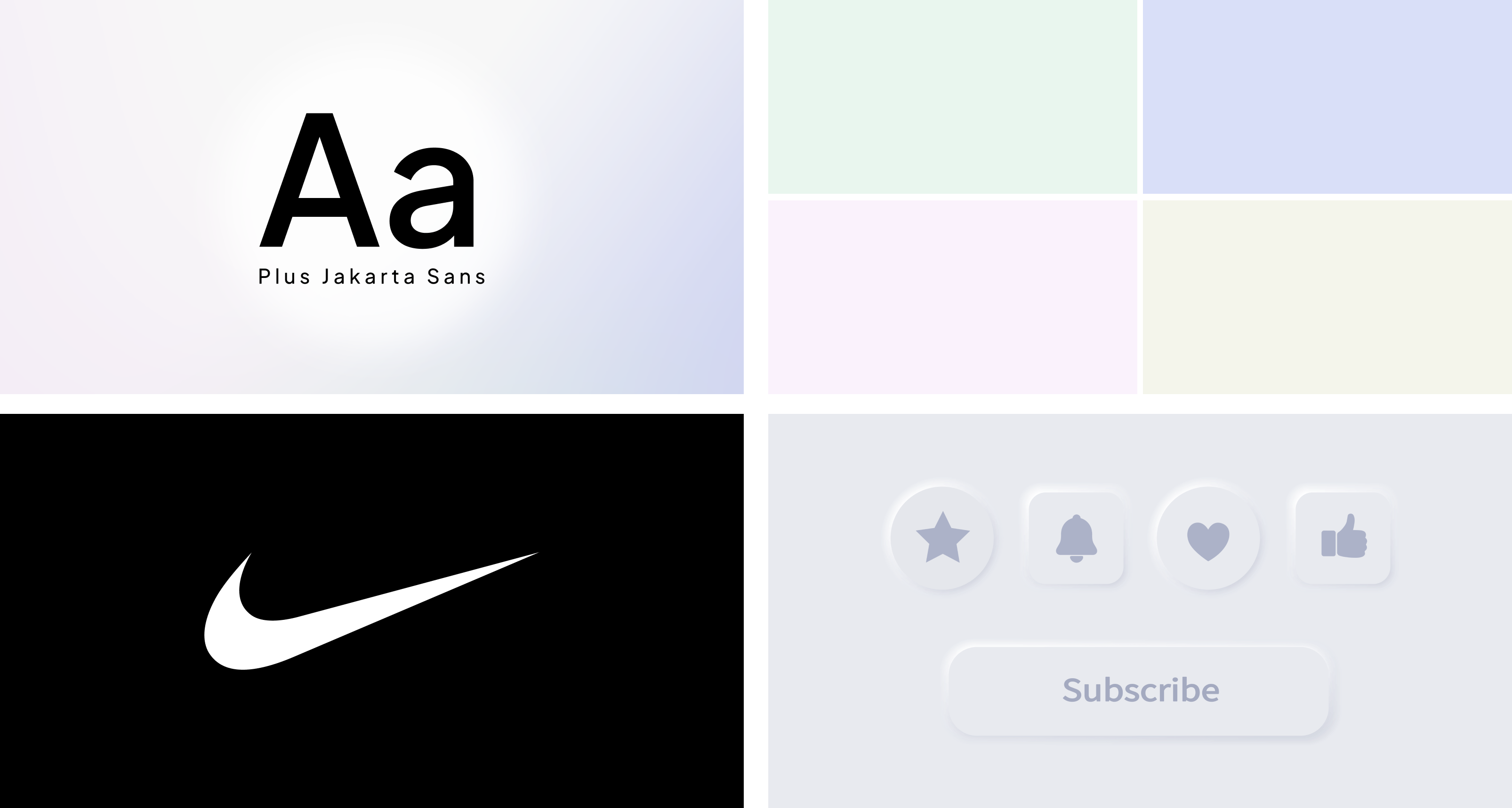
The elements in visual storytelling possess the ability to bolster a brand's narrative or message. Choosing typography, color palettes, logo symbology, and following design trends can significantly contribute to the visual and emotional coherence of the story being conveyed.
→ Typography: Typography refers to the style, size, and arrangement of letters and characters in a design. It's pivotal in visual design as choosing suitable typography can convey a brand or message's personality.
Recommendation: It needs to align with branding trends and should be efficient in communication. Typography for a brand consumed through mobile phones needs to be legible. If it's aimed more at the printed world, its specifications should be understood, it must be on trend and modern, and it should also communicate the brand's values.
For instance, "Helvetica" typography is known for its simplicity and readability. It has been used in brands like Panasonic and Toyota for its modern and clean appearance.
→ Color Palette: It refers to the specific colors chosen for a design. Colors wield a powerful emotional and psychological impact, choosing a color palette crucial in visual design.
An example would be the vibrant and striking color palette used by the Gatorade beverage brand. These colors convey energy and vitality, aligning with their message of hydration and sports performance.
Recommendation: The color palette must be well-considered to meet the brand's objectives. Generally, a brand's color palette needs to be analyzed concerning competition. What are the direct competitors using to try to differentiate?
For instance, imagine having a soap brand. If you use a color like turquoise without realizing that another famous brand already uses it, you might seem like a copy of that brand as your audience grows and notices the similarity. It's essential to be aware of the color palette used by other brands to ensure that your choice remains original and authentic.
→ Logo Symbology: It refers to the graphic elements or symbols composing a brand's visual identity. These elements range from simple shapes to complex images representing the essence of the brand.
An iconic example is Nike's logo, known as the "Swoosh." This simple yet powerful symbol represents movement, speed, and victory, aligning with the brand's message.
Recommendation: When creating a logo or brand, it's often said that less is more. Achieving the simplest and clearest form of a logo is quite a challenge.
For instance, Apple's logo consists of a bitten apple, a simple and instantly recognizable image worldwide. Despite its simplicity, this iconic representation has become a powerful symbol of innovation, creativity, and excellence in technological products.
→ Design Trends: These are the prevailing currents or styles in graphic design at a given moment. These trends can influence how designs look and feel in a specific period.
An example of a trend is "neumorphism," characterized by visual elements imitating real-world objects with subtle shadows and 3D effects. This trend aims to create more realistic and tactile designs in digital interfaces.
Recommendation: Design trends split into two paths: following a lasting trend that can endure for more than 5 years or pursuing current trends related to fashions lasting less than 5 years. A typical case could be, suppose you choose the Cyberpunk trend for your brand because it fits perfectly. Still, after 5 years, that trend is outdated, and everything is leaning toward minimalism. Then, your brand starts looking old and ceases to be attractive. This may prompt the client to reinvest in rebranding or improving the brand.
By strategically using these elements, a brand's visual identity can be strengthened, its message reinforced, and a stronger connection can be established with its audience. If a brand wants to convey a message of seriousness and professionalism, it might use classic typography, a sober color palette, a logo reflecting stability, and adopt a minimalist aesthetic aligned with current design trends.
What aspect should be considered to ensure coherence between visual storytelling and a brand's values?
We believe conducting brand research is fundamental to ensure that visual storytelling is in harmony with the company's core values. This investigation provides a clear understanding of the core values, thus ensuring that the visual narrative aligns with them.
By delving deeper into the research, we identify visual elements that best represent these values. This allows us to select symbols, colors, or shapes that can effectively convey the brand's principles and beliefs through visual storytelling, thereby creating a more meaningful connection with the audience.
It also contributes to understanding how these values impact perception and emotional connection with the audience. Moreover, it establishes clear guidelines for visual communication, ensuring coherence and consistency in the brand's representation across different platforms and over time. Finally, during research, we can identify unique and authentic aspects that distinguish the company from its competition.
An illustrative example is Nano Kigel. He had four core values: respect, empathy, innovation, and creativity. We chose a modular geometric design style and created symbols representing these values using geometric forms.
To represent empathy, we initially created a circle with an X, but it didn't convey the right message. After several attempts, we discovered that two interlinked circles explained better the idea of closeness and empathy, reflecting that value.
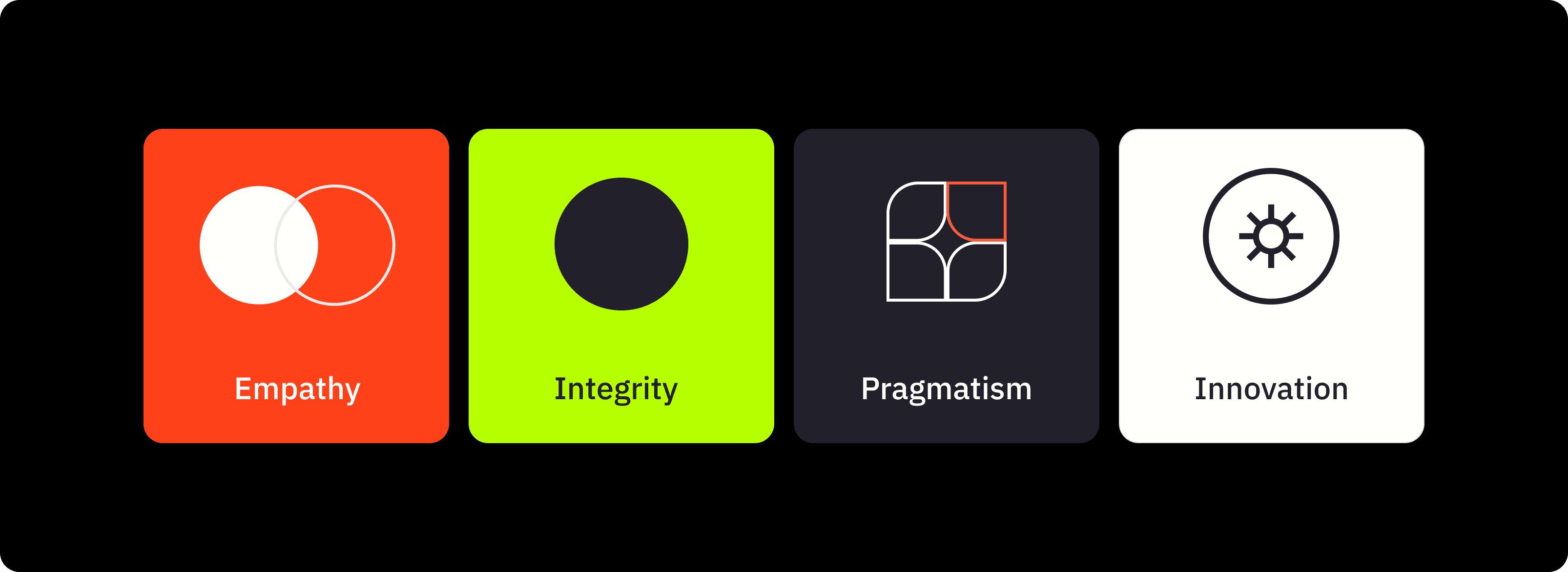
At Noodlesoup, we observe current design trends for inspiration, but we ensure our choices are timeless. For instance, we opt for sans-serif typography and adjust spacing to ensure good readability over time.
Some brands follow the trend of modular design for their logos. Sometimes it works well, but other times the typography isn't easy to read. That's why we seek a balance between the trend, the brand's aspects, and functionality. When using trendy symbols, we soften them a bit to not follow the trend too obviously but still add something appealing to the brand. This allows us to maintain a current style without compromising readability or the essence of the brand.
What's the connection between visual storytelling and user experience on a website?
Visual storytelling on a website plays a huge role in shaping the user experience. By conveying messages through images, videos, and visual elements, it creates an emotional link that enriches how users interact with the site.
This kind of visual narrative doesn't just make things easier to understand; it speeds up how fast users absorb information. Visual elements break down complex concepts in a clearer way, making it easier for users to find what they're looking for.
Moreover, visual storytelling grabs the user's attention, making them stay longer on the page and remember more information. This deeper engagement leads to a stronger bond with the brand when the visual story consistently reflects its values and identity.
Another key aspect is how visual storytelling intuitively guides page navigation. Placing visual elements strategically directs the user's focus to key sections, improving the browsing experience and encouraging interaction with the content.
When we work on projects, we always consider how your brand will look on both computers and mobile devices. For mobile, sometimes displaying the full brand name isn't necessary. Instead, we create a symbol or icon representing the brand. That way, when someone visits the page from a mobile device, this symbol will show up instead of the full brand name.
For instance, with Federica Vegas, another one of our clients, we created a symbol using the letters "F" and "V" that served as an adaptable version of their logo.
Success Story:
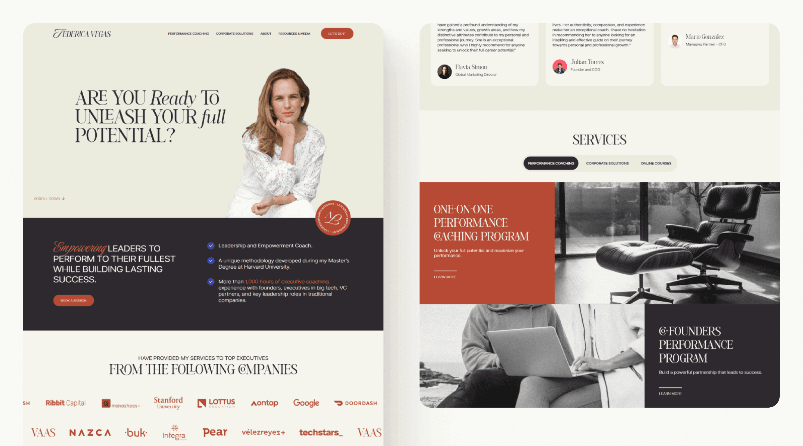
Federica Vegas used to target a female audience using soft colors, mostly pinks, especially on Instagram. But she later decided to focus on high-level entrepreneurs, both men and women. The challenge was to maintain her brand's strength without losing its feminine essence. To adapt the brand to this new group, we chose an elegant, script font. We introduced colors like terracotta, blue, and yellow while keeping the pink but making it more vibrant.
These changes made the brand grow significantly and be ready for the new audience. In fact, by the end of the project, Federica said, "I want to be like that person in the personal brand we built together. I'm going to work to become that." This shows how impactful the transformation of her brand was and how she identified with the new image we created.
Conclusion:
Ready to unleash the power of your brand? By prioritizing its principles, goals, and values, you lay the groundwork for authentic storytelling and audience engagement. Don't wait for a finished product – invest in building a brand that resonates from the inside out. Remember, what truly compels consumers isn't what you offer, but why you offer it. Let your passion shine through, and watch your audience embrace your brand as their own.
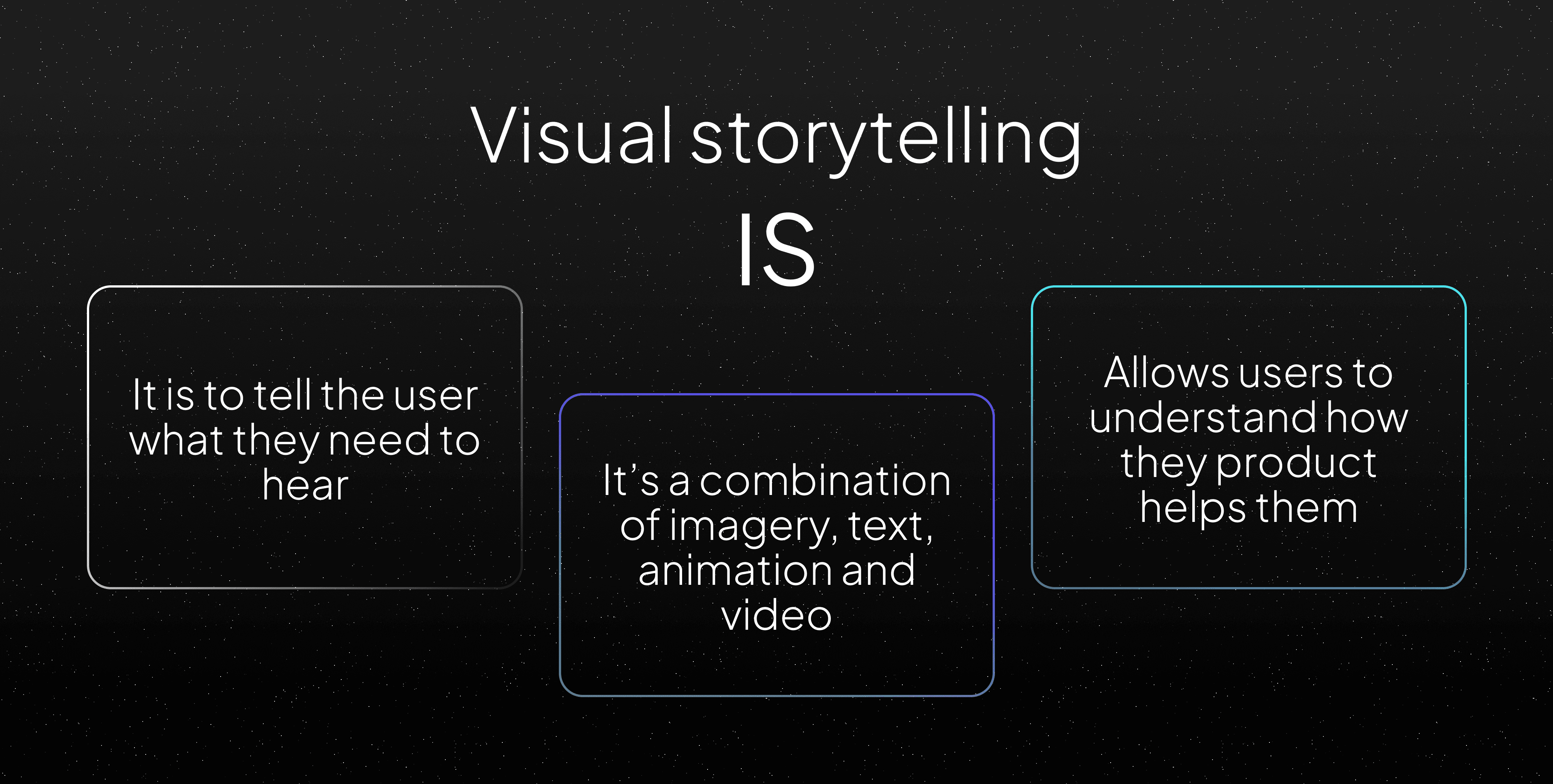
What is visual storytelling? What is its purpose?
The visual storyteling is a technique that uses images, graphics, videos, and visual elements to share a story or convey a message. Unlike traditional storytelling, which relies on words to create a narrative, visual storytelling harnesses the power of images to communicate in a striking and effective manner.
This method goes beyond mere storytelling; it aims to craft an engaging involvement that seizes the audience's focus and establishes a heartfelt bond. It acts as a powerful instrument in shaping a brand by providing a more captivating and unforgettable means of expressing a company's principles, objectives, and character.
What is the importance of visual storytelling in brand creation?
The importance of visual storytelling in brand creation is monumental in today's landscape. Its power lies in several key aspects that directly impact audience connection.
Firstly, visual storytelling establishes a deep emotional connection. Images and visual elements convey messages swiftly and powerfully, creating an immersive experience that resonates in the consumer's memory. This emotional connection goes beyond the rational, allowing the brand to root itself in the audience's feelings.
Moreover, visual storytelling stands out as a differentiating tool in an information-saturated and competitive environment. A solid and engaging visual narrative has the power to shine amidst a sea of visual stimuli, capturing attention and making the brand memorable to its audience.
Another key factor is the ability of visual storytelling to facilitate understanding and information retention. Its visual nature simplifies the data absorption process for consumers, increasing the likelihood that the brand's story will be remembered and understood.
Lastly, the versatility of visual storytelling is another feather in its cap. It easily adapts to a wide array of platforms, from social media to websites and mobile applications, enabling a coherent and effective strategy across different communication channels.

In Noodlesoup, our main focus in creating good visual storytelling lies in delving into the customer's and project's needs. Some of the key questions we ponder for deeper insight are:
• How can we tackle the challenge posed by the brand?
• What would be the most effective ways to tell this story?
• What elements do I need for this storytelling?
This Q&A process is vital for grasping a client's brand vision. It involves analyzing voice tone, defining goals, understanding the target audience, assessing communication channels, and determining the extent of brand transformation—ranging from a complete overhaul to ecosystem expansion or introducing new services. This systematic approach ensures a comprehensive understanding of the client's brand aspirations.
Here is a list of some questions to do so:
What is this person currently expressing?
What are the goals they want to achieve for this person or product?
What is the audience that will consume the brand like?
What channels are they using?
Do they want a 180-degree change or just to expand the brand's resources?
Do they want a complete brand revamp?
Do they want to expand the ecosystem?
Do they want to introduce a new service, and will that new service be integrated into their current brand?
An excellent example would be when one of our clients, whose audience was mainly on WhatsApp, wanted to enhance the storytelling of their brand. In the creation process, we realized we needed to focus significantly on the resources they had to use in this network to communicate with their customers. So, a great idea struck us: What better way to enrich this brand's storytelling on WhatsApp than through stickers? These ranged from symbols to messages and allowed us to keep telling the client's story.
Elements and recommendations that enhance the effectiveness of visual storytelling within a brand:

The elements in visual storytelling possess the ability to bolster a brand's narrative or message. Choosing typography, color palettes, logo symbology, and following design trends can significantly contribute to the visual and emotional coherence of the story being conveyed.
→ Typography: Typography refers to the style, size, and arrangement of letters and characters in a design. It's pivotal in visual design as choosing suitable typography can convey a brand or message's personality.
Recommendation: It needs to align with branding trends and should be efficient in communication. Typography for a brand consumed through mobile phones needs to be legible. If it's aimed more at the printed world, its specifications should be understood, it must be on trend and modern, and it should also communicate the brand's values.
For instance, "Helvetica" typography is known for its simplicity and readability. It has been used in brands like Panasonic and Toyota for its modern and clean appearance.
→ Color Palette: It refers to the specific colors chosen for a design. Colors wield a powerful emotional and psychological impact, choosing a color palette crucial in visual design.
An example would be the vibrant and striking color palette used by the Gatorade beverage brand. These colors convey energy and vitality, aligning with their message of hydration and sports performance.
Recommendation: The color palette must be well-considered to meet the brand's objectives. Generally, a brand's color palette needs to be analyzed concerning competition. What are the direct competitors using to try to differentiate?
For instance, imagine having a soap brand. If you use a color like turquoise without realizing that another famous brand already uses it, you might seem like a copy of that brand as your audience grows and notices the similarity. It's essential to be aware of the color palette used by other brands to ensure that your choice remains original and authentic.
→ Logo Symbology: It refers to the graphic elements or symbols composing a brand's visual identity. These elements range from simple shapes to complex images representing the essence of the brand.
An iconic example is Nike's logo, known as the "Swoosh." This simple yet powerful symbol represents movement, speed, and victory, aligning with the brand's message.
Recommendation: When creating a logo or brand, it's often said that less is more. Achieving the simplest and clearest form of a logo is quite a challenge.
For instance, Apple's logo consists of a bitten apple, a simple and instantly recognizable image worldwide. Despite its simplicity, this iconic representation has become a powerful symbol of innovation, creativity, and excellence in technological products.
→ Design Trends: These are the prevailing currents or styles in graphic design at a given moment. These trends can influence how designs look and feel in a specific period.
An example of a trend is "neumorphism," characterized by visual elements imitating real-world objects with subtle shadows and 3D effects. This trend aims to create more realistic and tactile designs in digital interfaces.
Recommendation: Design trends split into two paths: following a lasting trend that can endure for more than 5 years or pursuing current trends related to fashions lasting less than 5 years. A typical case could be, suppose you choose the Cyberpunk trend for your brand because it fits perfectly. Still, after 5 years, that trend is outdated, and everything is leaning toward minimalism. Then, your brand starts looking old and ceases to be attractive. This may prompt the client to reinvest in rebranding or improving the brand.
By strategically using these elements, a brand's visual identity can be strengthened, its message reinforced, and a stronger connection can be established with its audience. If a brand wants to convey a message of seriousness and professionalism, it might use classic typography, a sober color palette, a logo reflecting stability, and adopt a minimalist aesthetic aligned with current design trends.
What aspect should be considered to ensure coherence between visual storytelling and a brand's values?
We believe conducting brand research is fundamental to ensure that visual storytelling is in harmony with the company's core values. This investigation provides a clear understanding of the core values, thus ensuring that the visual narrative aligns with them.
By delving deeper into the research, we identify visual elements that best represent these values. This allows us to select symbols, colors, or shapes that can effectively convey the brand's principles and beliefs through visual storytelling, thereby creating a more meaningful connection with the audience.
It also contributes to understanding how these values impact perception and emotional connection with the audience. Moreover, it establishes clear guidelines for visual communication, ensuring coherence and consistency in the brand's representation across different platforms and over time. Finally, during research, we can identify unique and authentic aspects that distinguish the company from its competition.
An illustrative example is Nano Kigel. He had four core values: respect, empathy, innovation, and creativity. We chose a modular geometric design style and created symbols representing these values using geometric forms.
To represent empathy, we initially created a circle with an X, but it didn't convey the right message. After several attempts, we discovered that two interlinked circles explained better the idea of closeness and empathy, reflecting that value.

At Noodlesoup, we observe current design trends for inspiration, but we ensure our choices are timeless. For instance, we opt for sans-serif typography and adjust spacing to ensure good readability over time.
Some brands follow the trend of modular design for their logos. Sometimes it works well, but other times the typography isn't easy to read. That's why we seek a balance between the trend, the brand's aspects, and functionality. When using trendy symbols, we soften them a bit to not follow the trend too obviously but still add something appealing to the brand. This allows us to maintain a current style without compromising readability or the essence of the brand.
What's the connection between visual storytelling and user experience on a website?
Visual storytelling on a website plays a huge role in shaping the user experience. By conveying messages through images, videos, and visual elements, it creates an emotional link that enriches how users interact with the site.
This kind of visual narrative doesn't just make things easier to understand; it speeds up how fast users absorb information. Visual elements break down complex concepts in a clearer way, making it easier for users to find what they're looking for.
Moreover, visual storytelling grabs the user's attention, making them stay longer on the page and remember more information. This deeper engagement leads to a stronger bond with the brand when the visual story consistently reflects its values and identity.
Another key aspect is how visual storytelling intuitively guides page navigation. Placing visual elements strategically directs the user's focus to key sections, improving the browsing experience and encouraging interaction with the content.
When we work on projects, we always consider how your brand will look on both computers and mobile devices. For mobile, sometimes displaying the full brand name isn't necessary. Instead, we create a symbol or icon representing the brand. That way, when someone visits the page from a mobile device, this symbol will show up instead of the full brand name.
For instance, with Federica Vegas, another one of our clients, we created a symbol using the letters "F" and "V" that served as an adaptable version of their logo.
Success Story:

Federica Vegas used to target a female audience using soft colors, mostly pinks, especially on Instagram. But she later decided to focus on high-level entrepreneurs, both men and women. The challenge was to maintain her brand's strength without losing its feminine essence. To adapt the brand to this new group, we chose an elegant, script font. We introduced colors like terracotta, blue, and yellow while keeping the pink but making it more vibrant.
These changes made the brand grow significantly and be ready for the new audience. In fact, by the end of the project, Federica said, "I want to be like that person in the personal brand we built together. I'm going to work to become that." This shows how impactful the transformation of her brand was and how she identified with the new image we created.
Conclusion:
Ready to unleash the power of your brand? By prioritizing its principles, goals, and values, you lay the groundwork for authentic storytelling and audience engagement. Don't wait for a finished product – invest in building a brand that resonates from the inside out. Remember, what truly compels consumers isn't what you offer, but why you offer it. Let your passion shine through, and watch your audience embrace your brand as their own.

What is visual storytelling? What is its purpose?
The visual storyteling is a technique that uses images, graphics, videos, and visual elements to share a story or convey a message. Unlike traditional storytelling, which relies on words to create a narrative, visual storytelling harnesses the power of images to communicate in a striking and effective manner.
This method goes beyond mere storytelling; it aims to craft an engaging involvement that seizes the audience's focus and establishes a heartfelt bond. It acts as a powerful instrument in shaping a brand by providing a more captivating and unforgettable means of expressing a company's principles, objectives, and character.
What is the importance of visual storytelling in brand creation?
The importance of visual storytelling in brand creation is monumental in today's landscape. Its power lies in several key aspects that directly impact audience connection.
Firstly, visual storytelling establishes a deep emotional connection. Images and visual elements convey messages swiftly and powerfully, creating an immersive experience that resonates in the consumer's memory. This emotional connection goes beyond the rational, allowing the brand to root itself in the audience's feelings.
Moreover, visual storytelling stands out as a differentiating tool in an information-saturated and competitive environment. A solid and engaging visual narrative has the power to shine amidst a sea of visual stimuli, capturing attention and making the brand memorable to its audience.
Another key factor is the ability of visual storytelling to facilitate understanding and information retention. Its visual nature simplifies the data absorption process for consumers, increasing the likelihood that the brand's story will be remembered and understood.
Lastly, the versatility of visual storytelling is another feather in its cap. It easily adapts to a wide array of platforms, from social media to websites and mobile applications, enabling a coherent and effective strategy across different communication channels.

In Noodlesoup, our main focus in creating good visual storytelling lies in delving into the customer's and project's needs. Some of the key questions we ponder for deeper insight are:
• How can we tackle the challenge posed by the brand?
• What would be the most effective ways to tell this story?
• What elements do I need for this storytelling?
This Q&A process is vital for grasping a client's brand vision. It involves analyzing voice tone, defining goals, understanding the target audience, assessing communication channels, and determining the extent of brand transformation—ranging from a complete overhaul to ecosystem expansion or introducing new services. This systematic approach ensures a comprehensive understanding of the client's brand aspirations.
Here is a list of some questions to do so:
What is this person currently expressing?
What are the goals they want to achieve for this person or product?
What is the audience that will consume the brand like?
What channels are they using?
Do they want a 180-degree change or just to expand the brand's resources?
Do they want a complete brand revamp?
Do they want to expand the ecosystem?
Do they want to introduce a new service, and will that new service be integrated into their current brand?
An excellent example would be when one of our clients, whose audience was mainly on WhatsApp, wanted to enhance the storytelling of their brand. In the creation process, we realized we needed to focus significantly on the resources they had to use in this network to communicate with their customers. So, a great idea struck us: What better way to enrich this brand's storytelling on WhatsApp than through stickers? These ranged from symbols to messages and allowed us to keep telling the client's story.
Elements and recommendations that enhance the effectiveness of visual storytelling within a brand:

The elements in visual storytelling possess the ability to bolster a brand's narrative or message. Choosing typography, color palettes, logo symbology, and following design trends can significantly contribute to the visual and emotional coherence of the story being conveyed.
→ Typography: Typography refers to the style, size, and arrangement of letters and characters in a design. It's pivotal in visual design as choosing suitable typography can convey a brand or message's personality.
Recommendation: It needs to align with branding trends and should be efficient in communication. Typography for a brand consumed through mobile phones needs to be legible. If it's aimed more at the printed world, its specifications should be understood, it must be on trend and modern, and it should also communicate the brand's values.
For instance, "Helvetica" typography is known for its simplicity and readability. It has been used in brands like Panasonic and Toyota for its modern and clean appearance.
→ Color Palette: It refers to the specific colors chosen for a design. Colors wield a powerful emotional and psychological impact, choosing a color palette crucial in visual design.
An example would be the vibrant and striking color palette used by the Gatorade beverage brand. These colors convey energy and vitality, aligning with their message of hydration and sports performance.
Recommendation: The color palette must be well-considered to meet the brand's objectives. Generally, a brand's color palette needs to be analyzed concerning competition. What are the direct competitors using to try to differentiate?
For instance, imagine having a soap brand. If you use a color like turquoise without realizing that another famous brand already uses it, you might seem like a copy of that brand as your audience grows and notices the similarity. It's essential to be aware of the color palette used by other brands to ensure that your choice remains original and authentic.
→ Logo Symbology: It refers to the graphic elements or symbols composing a brand's visual identity. These elements range from simple shapes to complex images representing the essence of the brand.
An iconic example is Nike's logo, known as the "Swoosh." This simple yet powerful symbol represents movement, speed, and victory, aligning with the brand's message.
Recommendation: When creating a logo or brand, it's often said that less is more. Achieving the simplest and clearest form of a logo is quite a challenge.
For instance, Apple's logo consists of a bitten apple, a simple and instantly recognizable image worldwide. Despite its simplicity, this iconic representation has become a powerful symbol of innovation, creativity, and excellence in technological products.
→ Design Trends: These are the prevailing currents or styles in graphic design at a given moment. These trends can influence how designs look and feel in a specific period.
An example of a trend is "neumorphism," characterized by visual elements imitating real-world objects with subtle shadows and 3D effects. This trend aims to create more realistic and tactile designs in digital interfaces.
Recommendation: Design trends split into two paths: following a lasting trend that can endure for more than 5 years or pursuing current trends related to fashions lasting less than 5 years. A typical case could be, suppose you choose the Cyberpunk trend for your brand because it fits perfectly. Still, after 5 years, that trend is outdated, and everything is leaning toward minimalism. Then, your brand starts looking old and ceases to be attractive. This may prompt the client to reinvest in rebranding or improving the brand.
By strategically using these elements, a brand's visual identity can be strengthened, its message reinforced, and a stronger connection can be established with its audience. If a brand wants to convey a message of seriousness and professionalism, it might use classic typography, a sober color palette, a logo reflecting stability, and adopt a minimalist aesthetic aligned with current design trends.
What aspect should be considered to ensure coherence between visual storytelling and a brand's values?
We believe conducting brand research is fundamental to ensure that visual storytelling is in harmony with the company's core values. This investigation provides a clear understanding of the core values, thus ensuring that the visual narrative aligns with them.
By delving deeper into the research, we identify visual elements that best represent these values. This allows us to select symbols, colors, or shapes that can effectively convey the brand's principles and beliefs through visual storytelling, thereby creating a more meaningful connection with the audience.
It also contributes to understanding how these values impact perception and emotional connection with the audience. Moreover, it establishes clear guidelines for visual communication, ensuring coherence and consistency in the brand's representation across different platforms and over time. Finally, during research, we can identify unique and authentic aspects that distinguish the company from its competition.
An illustrative example is Nano Kigel. He had four core values: respect, empathy, innovation, and creativity. We chose a modular geometric design style and created symbols representing these values using geometric forms.
To represent empathy, we initially created a circle with an X, but it didn't convey the right message. After several attempts, we discovered that two interlinked circles explained better the idea of closeness and empathy, reflecting that value.

At Noodlesoup, we observe current design trends for inspiration, but we ensure our choices are timeless. For instance, we opt for sans-serif typography and adjust spacing to ensure good readability over time.
Some brands follow the trend of modular design for their logos. Sometimes it works well, but other times the typography isn't easy to read. That's why we seek a balance between the trend, the brand's aspects, and functionality. When using trendy symbols, we soften them a bit to not follow the trend too obviously but still add something appealing to the brand. This allows us to maintain a current style without compromising readability or the essence of the brand.
What's the connection between visual storytelling and user experience on a website?
Visual storytelling on a website plays a huge role in shaping the user experience. By conveying messages through images, videos, and visual elements, it creates an emotional link that enriches how users interact with the site.
This kind of visual narrative doesn't just make things easier to understand; it speeds up how fast users absorb information. Visual elements break down complex concepts in a clearer way, making it easier for users to find what they're looking for.
Moreover, visual storytelling grabs the user's attention, making them stay longer on the page and remember more information. This deeper engagement leads to a stronger bond with the brand when the visual story consistently reflects its values and identity.
Another key aspect is how visual storytelling intuitively guides page navigation. Placing visual elements strategically directs the user's focus to key sections, improving the browsing experience and encouraging interaction with the content.
When we work on projects, we always consider how your brand will look on both computers and mobile devices. For mobile, sometimes displaying the full brand name isn't necessary. Instead, we create a symbol or icon representing the brand. That way, when someone visits the page from a mobile device, this symbol will show up instead of the full brand name.
For instance, with Federica Vegas, another one of our clients, we created a symbol using the letters "F" and "V" that served as an adaptable version of their logo.
Success Story:

Federica Vegas used to target a female audience using soft colors, mostly pinks, especially on Instagram. But she later decided to focus on high-level entrepreneurs, both men and women. The challenge was to maintain her brand's strength without losing its feminine essence. To adapt the brand to this new group, we chose an elegant, script font. We introduced colors like terracotta, blue, and yellow while keeping the pink but making it more vibrant.
These changes made the brand grow significantly and be ready for the new audience. In fact, by the end of the project, Federica said, "I want to be like that person in the personal brand we built together. I'm going to work to become that." This shows how impactful the transformation of her brand was and how she identified with the new image we created.
Conclusion:
Ready to unleash the power of your brand? By prioritizing its principles, goals, and values, you lay the groundwork for authentic storytelling and audience engagement. Don't wait for a finished product – invest in building a brand that resonates from the inside out. Remember, what truly compels consumers isn't what you offer, but why you offer it. Let your passion shine through, and watch your audience embrace your brand as their own.

Acerca de nosotros
Acerca de nosotros
Acerca de nosotros
El estudio fue fundado en 2022 por Alejandro Duarte, diseñador multidisciplinario con más de 10 años de experiencia en la creación de productos digitales premiados y en colaborar con marcas de la Fortune 500. Junto a Sasha Briceño, directora creativa híbrida con formación en comunicación social que combina su pasión por las imágenes, el pensamiento estratégico y el storytelling, para crear universos de marca verbales y visuales consistentes. En Noodlesoup, somos un equipo apasionado por el buen diseño y comprometido con proyectos que tienen un propósito significativo. La colaboración, entre el equipo y con nuestros clientes, está en el corazón de todo lo que hacemos: es el umami* que nos caracteriza.
*Japonés: Conocido como el quinto sabor, es uno de los gustos básicos junto con el dulce, el ácido, el amargo y el salado. También significa sabroso.

